Contact Us on [email protected] or 07866 017 438 

Mobile friendly website design

Your website will look good on any device

All our websites are designed and built to be “Responsive” or mobile friendly so they look good on any device including a large desktop screen, laptop, a tablet or a mobile phone.

Responsive Website Design means that a website is designed and built so that it works on any size screen or device!

Search engine Optimised

To help you get found Online

We make sure your website is built so that Google and other search engines such as Yahoo and Bing are able to find it quickly, ensuring your site has a better search ranking than any of your competitors. We understand how search engine optimisation works and can incorporate these tools and important features into your website during the design process. The earlier we can factor this into a website design the better it will be. Also choosing a domain name (website address) that impacts your audience is vital, we will make sure we choose the best one for you.

Edit and update your own website

So you don’t have to pay someone to do it.

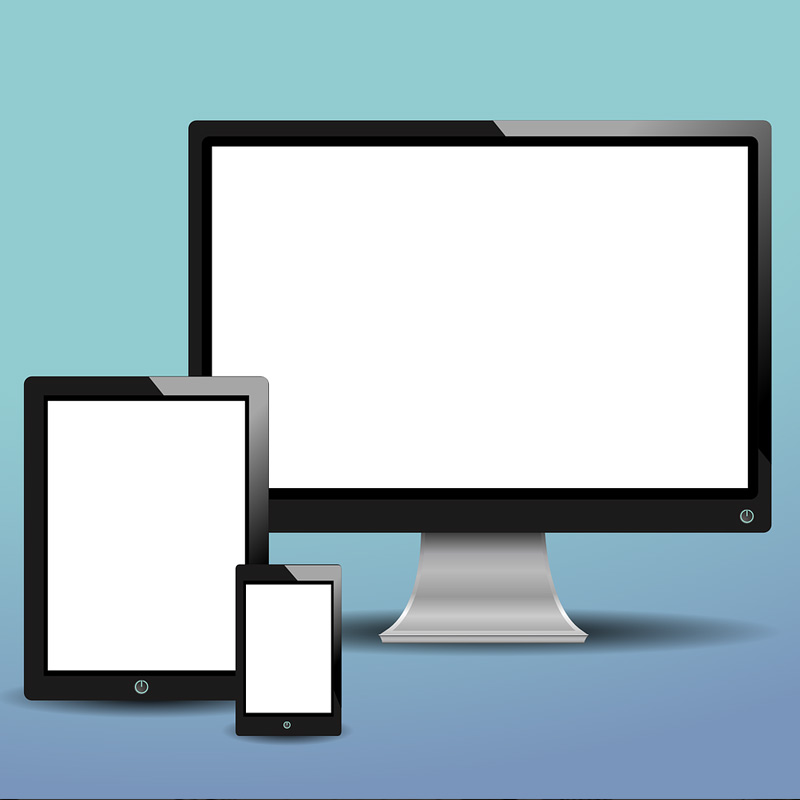
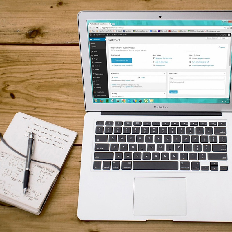
We know how important it is for you to edit your website. We use WordPress (one of the most popular content management systems available. WordPress allows allows you to update content, add photos and videos, change, edit and format the text on your website without having special coding knowledge. Keeping your content up to date and relevant is a great way to improve a website visitors experience and also for Search Engine Optimisation. You can also edit your website using a mobile phone, tablet, desktop computer or laptop from anywhere you happen to be and we will also show you how to do this we some 1-to1 training.

Some of Our Recent Website Design Work